

As the founder of the dataGOATs community, it’s something that comes up a lot during our discussions: What are analytics roles going to look like as AI continues to get better and better? Will it replace me, or will it just evolve?
I wanted to demonstrate what an evolution could look like for analysts and then try to answer the “will it replace me?” question. In order to do that, I took a dataset about AI applicability across various jobs (yes, I know, it’s very meta), one human analyst (me), and three different AI tools to give an honest comparison to what gives the best analysis, and in what ways.
I utilized a Github Repository to store the files and documentation, you can access that here if you’d like to try any of this for yourself or see my process.
I generated a basic process markdown file for each part of the project so you can see the steps I took to get to the insights I ultimately uncovered. Just go into the respective directories for each analysis workflow, or as I call them here, “The Contenders”.
I combined data from the Microsoft “AI Applicability” study with BOLS data because I went through several datasets on Kaggle in preparation for this process, and couldn’t find a data source on “AI and job impact” that didn’t have really weird miscategorizations and assumptions (e.g. dentist is classified as an “entertainment” industry job).
While I had my own “hot take” on the Microsoft “AI Applicability” Study (see that post here), I recognize that my own take on it may have been a little flawed as I read through their documentation further. The Microsoft Study wasn’t suggesting that you could use their data alone to determine if AI is going to replace the job. I think many of us took it a little too seriously. It’s really just how much you could use AI in the role for various tasks.
BOLS tends to have reliable and relatively clean data, and they use SOC Codes in the Microsoft data, so it allows me to augment the basic takeaways from the Microsoft study with standard occupational data from BOLS. An easy “left” join on the SOC Codes from the MS Data to combine the tables.
Funny note, the first column (SOC Code) in the Microsoft dataset had the classic “Excel perceives this as a date”, so I had to correct that before doing all my VLOOKUPs in GSheets.

The Microsoft Data ‘soc_ai_applicability_scores.csv’ has 3 key columns - SOC Code, Job Title and an AI Applicability Score. The BOLS dataset has 14 columns, 12 to the left of the SOC Code that I actually cared about, so it was simple to drag those headers over, create some VLOOKUPS under those headers, validate it transferred the data that I wanted, then copy/paste as values over my VLOOKUPS to preserve true values transferred from the other data.
This will be my final dataset that we’ll perform our analysis off of - with the goal of answering the following questions:
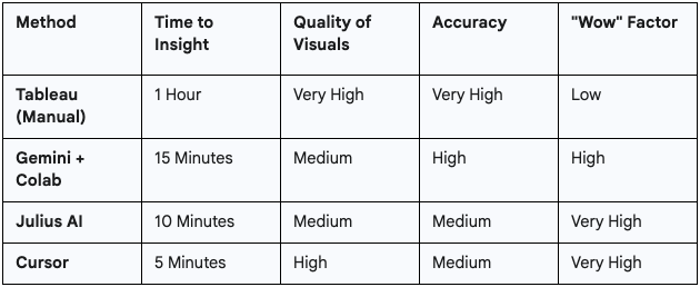
First, I had to set a baseline. To be fair, I’m not a Tableau expert, but I’m decent with it and have used other BI tools quite extensively. I wanted this to be a comparison of mostly free, accessible tools and Tableau Public is just that - free.
So, I fired up Tableau, imported my CSV as the data source and got to visualizing.
If you want all of the nitty-gritty details on how I put this together and the final dashboard, go see the Github documentation.
Results:
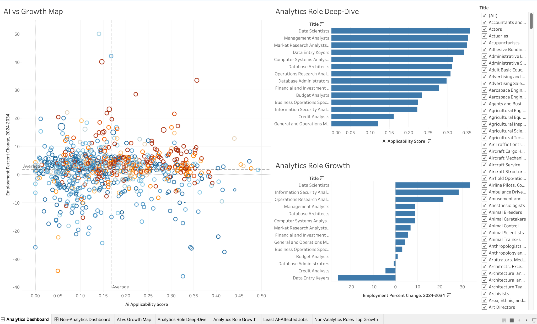
My Takeaway: It was manual. What you would expect. Every single insight was one I had to dig for myself, but hey… it seriously wasn’t bad, it’s the norm. Not my prettiest dashboard ever, but it is useful and got to my key insights.
Time to Insight: Approximately 1 hour creating documentation, the dashboard itself and publishing to Tableau Public.
Next, I opened a Google Colab notebook and started a chat with Gemini. I broke the process down into a series of 7 prompts, with one final prompt to create an interactive dashboard with the visuals in streamlit.
Results:
This was a night-and-day difference, but not necessarily 100% for the better. It was MUCH faster but not as clean.

My Takeaway: This is awesome when you need to create a few visuals quickly, but not as worried about “polish” like with the classic Tableau option. Quick, and dirty. As soon as I started prompting Gemini, it wrote code that I could execute in the notebook.
Time to Insight: 15 Minutes
This tool claims to do the entire job. No code, just prompts. I uploaded the CSV and asked it my questions (full prompts in Github).
Results:
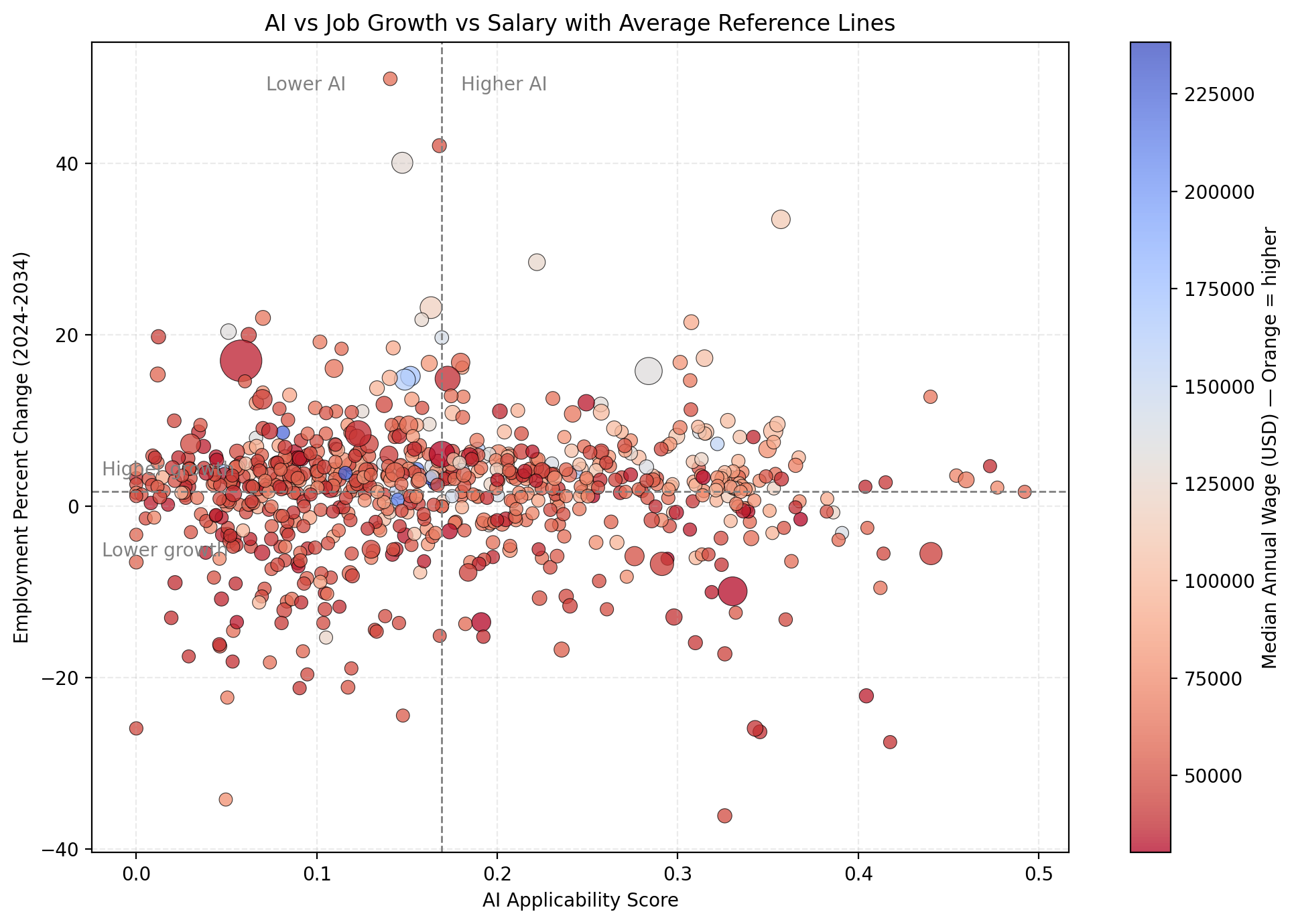
My Takeaway: For pure, rapid-fire exploratory data analysis, this is pretty great. It's like having an incredibly fast, slightly junior analyst at your fingertips.
Keep in mind, this is a relatively clean and straightforward dataset. I’m not sure how it performs on messier data, or poorly documented schemas when you’re connecting to a live database.
I do have a piece of feedback for Julius - the color scale ended up reversing in the chart above. Not critical, and not something that couldn’t be fixed easily, but I wanted to give an honest take of the tool and potential things you’ll need to look out for & adjust yourself, just as if you were working with a junior analyst to create an analysis.
Not perfect, but pretty damn good for the effort and time required.
Time to Insight: 10 Minutes
Cursor is more of a developer's tool. I wanted to know if it was "too much" for daily analysis, or if it could be useful for building out interactive dashboards. I’ve recently learned it could connect to Snowflake and write SQL queries, for instance.
Results:
Pretty incredible stuff. I literally just pulled down the Github repo I hosted this project in, told it to look at the Cursor directory and markdown reference file, then start building.

My Takeaway: Similar results in quality to the Colab-generated or Julius visuals, since it’s all generated with common Python libraries and then served up like Colab using Streamlit, but it did make everything a little more visually appealing (even if it probably needed some tweaking at the end too).
Having it create everything that quickly and present it in Streamlit is really impressive, considering it’s doing a lot of work on the backend to make all this happen, this quickly.
Time to Insight: 5 Minutes
If you’re curious about what I actually found in the data? Well, you’re welcome to dig into my Tableau Public dashboard or any of the other stuff I included in the Github repo.
Here’s a few Highlights:
So, is my job gone? Absolutely not. I think I proved effectively that I can do a higher quantity of analyses using these tools, and my job as a good analyst is still to ask the right questions, document my plan to conduct the analysis, then go after it.
I’m still doing that with the AI tools, it’s just doing a lot of the coding & building for me. I’m still directing. It’s more like I’m an analytics lead in this case, directing a junior.
Here’s how I would utilize each of the tools:
I have to admit, I still really enjoyed building the Tableau dashboard. It certainly wasn’t the fastest, but it looked the best to me in the end. Maybe that’s just my very human, emotional, nostalgic side. Maybe it’s my bias towards human creativity.
Though, the elephant in the room is… if I spent 3x more time dialing in Julius, Cursor or Colab, it likely would look better than my Tableau dashboard.
Perhaps that will be a future write-up.
What tools are you using? What did I miss?
Come join the conversation and share your own AI workflows in the GOATs Community.


.png)
