

In my previous article, Human Analyst vs. AI Analyst, I examined how three different AI tools would stack up against me (using Tableau) in analyzing a basic CSV dataset to find some insights.
Today, we go beyond the nice clean dataset (minus the date errors!) in a CSV. We're going to connect directly to a live Snowflake database and run queries, all within Google's New AI IDE: Antigravity.
The goal? To see if an AI Agent can act as a true extension of the analyst; navigating schemas, writing production-ready SQL, and visualizing the data within the IDE, all from a natural language prompt.
Want to follow along in greater detail? I've documented it all in this GitHub repo so you can see examples of code, prompts and more.
We are roleplaying a Senior Analyst at SunSpectra (our fictional retail company). It’s Monday morning, and the VP of Sales needs an "Executive Update" immediately. They aren't looking for a deep dive; they want a pulse check on performance to help them tell a story in their afternoon meeting with the C-suite.
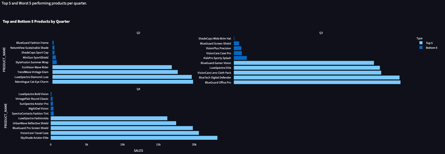
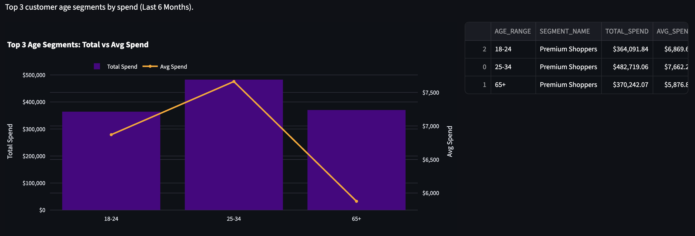
The VP has asked for three specific insights:
Note: For this analysis, Quarters are defined as calendar Q1 (Jan-Mar), Q2 (Apr-Jun), etc. and should be grouped by in charts & tables and labeled as Q1, Q2, Q3.
The biggest difference from how we used the Cursor IDE previously for data analysis, is that we're connecting to a live database this time.
Antigravity is very similar to Cursor, the IDE is the same, it's just a difference in the agents. Therefore, everything we're doing here should also work in Cursor.
Before asking the Agent to do anything, I need to connect it to the database and give it a context of the schema.
PRODUCT_ID to SKU) without us explicitly writing the joins every time.Key Discoveries documented, as in data_documentation.md:
CATALOG (Products), FINANCE (Transactions), CUSTOMER (Demographics), and SHIPBOB (Fulfillment).FINANCE.TRANSACTIONS did not contain customer or product IDs directly. It found the necessary bridge tables:SHIPBOB.ORDER_PRODUCTSPUBLIC.ORDERS (Initially assumed) vs SHIPBOB.ORDERS (Actual).Admitedly, the first time I set this up, it required asking some questions to my coworker (thanks Eden Litvin!) and Gemini. I was able to first make a connection to Snowflake via their extension for VS Code, but the agent couldn't interact with it. I thought about opting for setting up MCP server, but this method worked great.
This is mostly a one-time setup for the project, and should be repeatable for any future projects if you utilize the framework here.
pip install snowflake-connector-python[pandas] python-dotenv
snowflake_client.py) to handle the connection. We opted for standard password authentication stored in environment variables.# Snippet from snowflake_client.py
def get_connection():
    return snowflake.connector.connect(
# ... params ...
        password=os.getenv('SNOWFLAKE_PASSWORD')
    )
.env file to store our credentials. Crucially, since we're using Github for this repository, we added .env to our .gitignore file to prevent leaking secrets.SNOWFLAKE_ACCOUNT=YOURACCOUNT-IDENTIFIER
SNOWFLAKE_USER=YOUR_USERNAME
SNOWFLAKE_PASSWORD=YOUR_PASSWORD
SNOWFLAKE_ROLE=YOUR_ROLE
SNOWFLAKE_WAREHOUSE=YOUR_WH
SNOWFLAKE_DATABASE=YOUR_DB
SNOWFLAKE_SCHEMA=YOUR_SCHEMA
When substituting in real-world information for the above, a successful test connection was made.
Instead of blind prompting, I used a separate instance of Gemini to generate an Instruction Document for the Antigravity Agent. Think of this as translating "Business Ask" into "Robot Instructions".
I prefer to use this method when prompting agents, rather than just copy/pasting a large amount of instructions into a chat.
In my experience, this creates a better output with fewer follow-up steps since you're giving the tools a framework and criteria to work from.
While this seems like an extra step, you can use this template for other future projects, just filling in relevant details for the problem, and it enables the rest of this process to run smoothly.
See full prompts and process here.
We fed the instructions into the IDE Agent in three steps, having the agent work through one step completely & updating documentation, before moving to the next one.
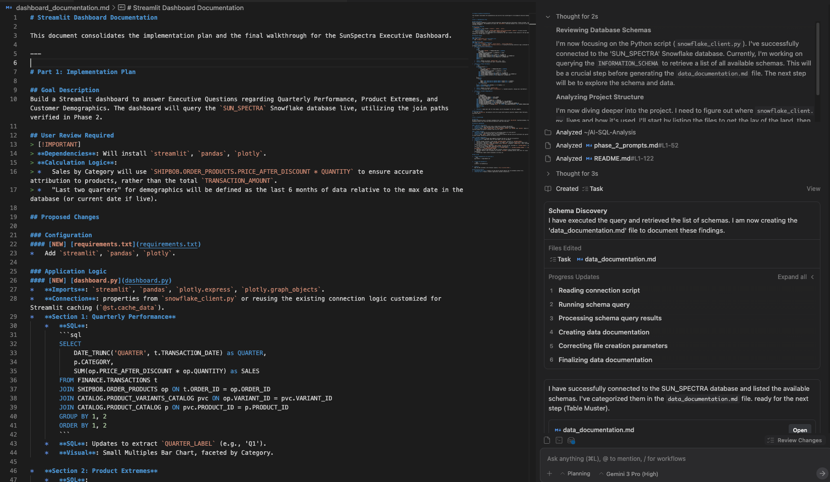
The agent created a data_documentation.md file during the above process. We'll use that now when feeding the following prompt to the agent:
Utilizing your discoveries within data_documentation.md, answer our three key questions from our executive and generate the charts needed for each question in a Streamlit dashboard that I can easily copy to a slide deck. For easy reference, here is the questions and charts requested:
Note: For this analysis, Quarters are defined as calendar Q1 (Jan-Mar), Q2 (Apr-Jun), etc. and should be grouped by in charts & tables and labeled as Q1, Q2, Q3.
Now, I'll go pour another cold brew while I wait for it to do it's thing.
It's done! We get the message that our Streamlit app is live and we can go view it on localhost:8501. Good news.
We also requested full documentation of the dashboard and data, so we have data_documentation.md and dashboard.md files for those of you who want all of the technical details.
Before I dive into the tasks, I must stop here and say while this felt like a lot of setup, when you see it in action, it feels very "magical" to have it run all of these queries and create documentation of the schemas, tables, and relationships.
But, it's not perfect. We hit a snag on Task 3, I'll dive into that below.
TRANSACTIONS to PRODUCT_CATALOG.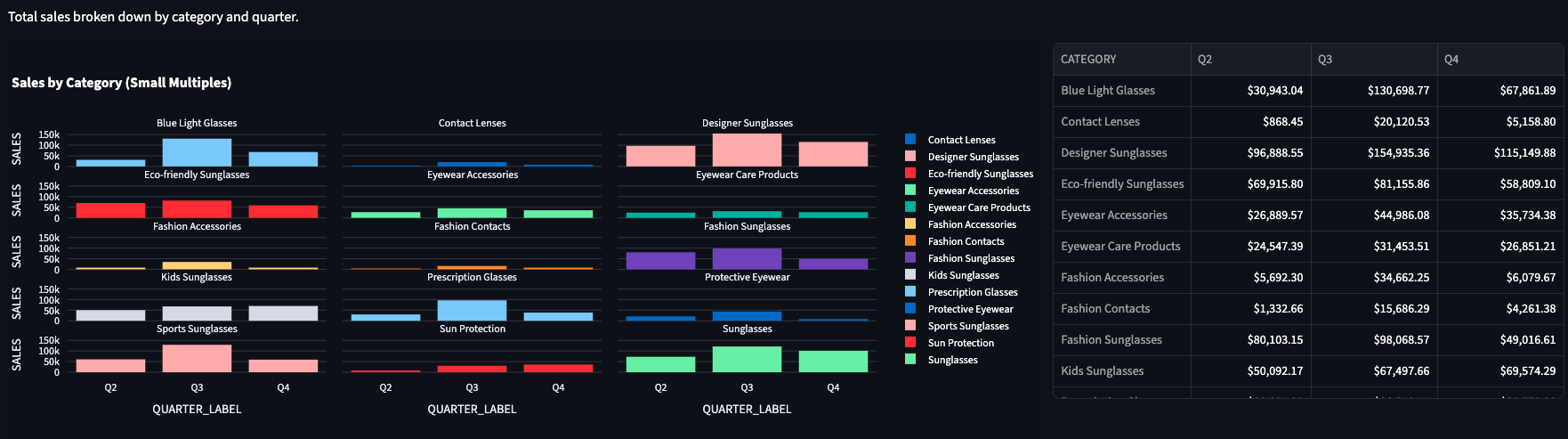
For some reason, we don't have a 35-65 category in the table. Sorry, fellow Millenials and Gen X'rs.
This is simulated data, to be fair - and yes, I did check in Snowflake just to make sure.
OK - so what was that snag I mentioned? The initial chart returned no data.
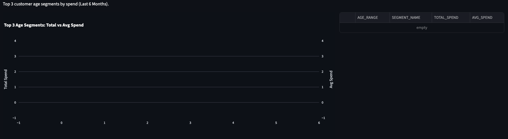
FINANCE.TRANSACTIONS to PUBLIC.ORDERS.dashboard_documentation.md), we discovered PUBLIC.ORDERS contained only 10 rows of test data.SHIPBOB.ORDERS (2,000+ rows). This did take a couple of follow up prompts, but nothing we couldn't solve within Antigravity, chatting with the Agent.

.png)
